MEDIA KIT
The DROP character, wordmark and colours
Everything you need to feature DROP, and the five rules that keep it looking right. For anything else, email team@xrp-drop.com.
Five rules
- 1
Transparent background, always
Every file here has a transparent background. Place it straight onto your design.
- 2
No box, no border
The character’s own black outline is its edge. Never put it in a box, a circle or a frame.
- 3
No recolouring
Use the colours as supplied. No tints, filters, gradients or outlines of your own.
- 4
Whole-number scaling only
Scale by 2×, 3×, 4× and so on, with smoothing turned off (“nearest neighbour”). Anything in between blurs the pixels.
- 5
Never on a dark ground
The outline is black, so a dark background swallows it. On dark designs use the light wordmark on its own.
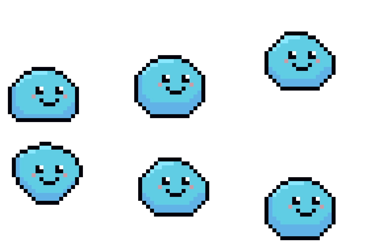
The character
The logo, in its own colours. Three sizes of the same artwork.



Wordmark and lockup
The name on its own, and the character with the name. Only the wordmark goes on dark grounds.



Colours
The site palette. The character is drawn from the same blues, ink and blush.
Sky
#009DFA
Page background
Surface
#EDFBFC
Cards and panels; the character’s eye white
Ink
#03040C
Text and every outline
DROP body
#5FCDE6
The character’s main fill
DROP light
#88E8FA
Highlights
DROP deep
#6AAEDD
Shading
Blush
#D09BA6
The cheeks; accents
Ink muted
#1C4B71
Secondary text on surface
Animations
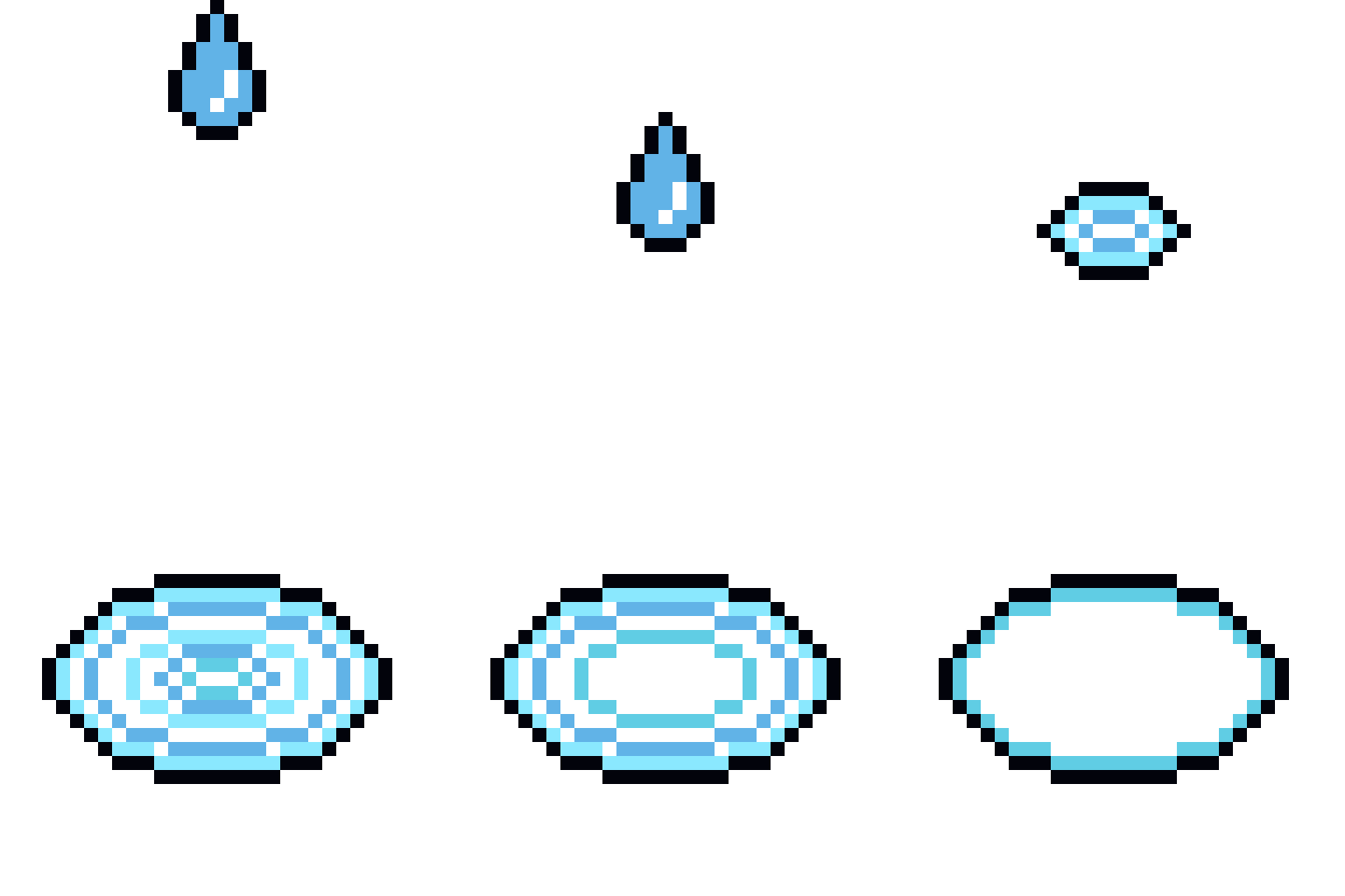
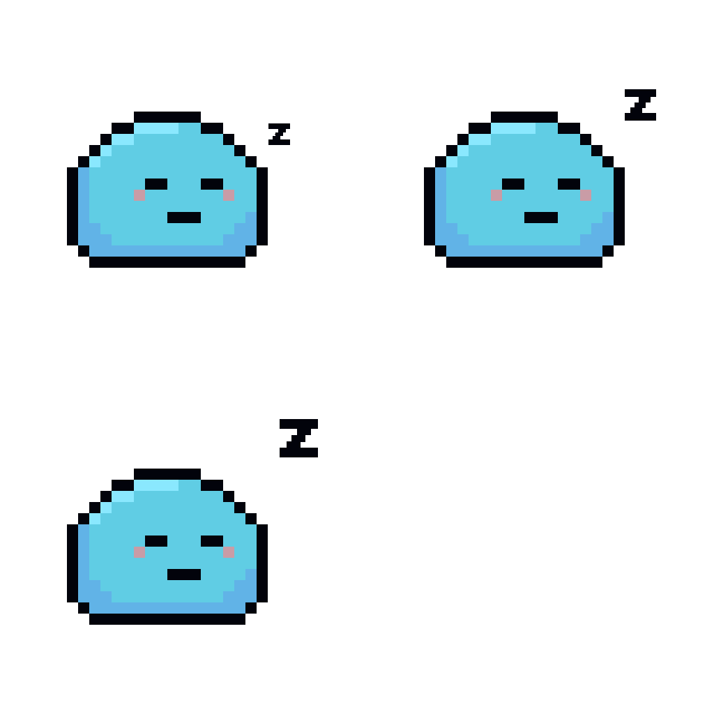
The full set of GIFs, on transparent backgrounds. Most are 512 px on a 32-block grid; the two earth loops are 416 px. Show them at a size that keeps each block whole: a multiple of 32 px.